UX/UI Case Study:
Chicago Wilderness Alliance Website Redesign
This course project was to redesign a non-profit website to better align with the organization's mission and audience. We used the design sprint methodology to guide the process, spending one week on each phase of the project.
We chose the Chicago Wilderness Alliance (CWA) for this project because their website had significant potential for improvement. CWA serves individuals in the Lake Michigan area who care deeply about the environment and are active in their communities, often through environmental organizations. The organization seeks to bridge the gap between younger and more experienced professionals in the environmental sector by drawing younger environmental advocates to the site.
Our goal was to redesign the website to better appeal to a younger demographic while still serving CWA’s broader audience. The final result is a mobile prototype designed to help users stay connected and easily sign up for opportunities to engage with others in the CWA network, ultimately supporting local environmental efforts.
Team members
Abigail Murphy (Analytical Thinking, Copy Writing)
Erin (Critical Thinking, Copywriting)
Lux (Strategic Thinking, Creative Problem-Solving)
Ysabella Johnson (Visual Communication, Strategic Thinking)
Project timeline
5 weeks
Tools used
Figma
Figjam (ideation)
Adobe Photoshop
Google Surveys (research)
Trello (project management)
Empathizing With Users
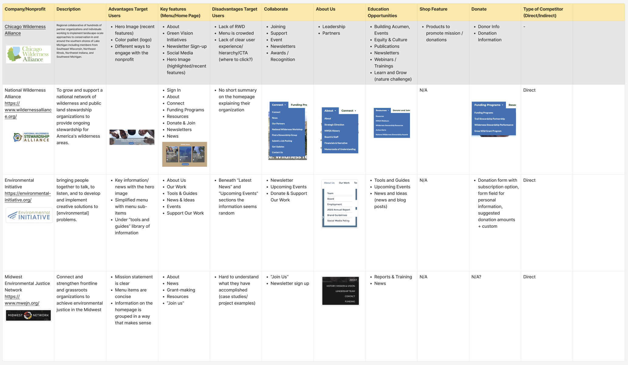
To better understand the needs of Chicago Wilderness Alliance website users, we began with a competitive analysis of other environmental and mission-driven non-profit websites. This helped us identify best practices for engaging audiences and highlighted areas where CWA's website could improve. While CWA offers a wealth of information, we found that its information architecture could better organized to navigate the site's content more easily. Additionally, the site’s user interface (UI) could benefit from improved content hierarchy and more visual interest.
We also conducted a Google survey to understand the behaviors and needs of younger adults (ages 18-36) who are advocates for or part of local causes.
Key insights included:
Word of mouth and social media were primary channels for discovering non-profits.
There was a strong desire to network—both online and in person.
Users expressed a need for clear opportunities to do so on a website Poor site navigation and a lack of clear, easily accessible information were common pain points when using non-profit websites.
We compared CWA with National Wilderness Stewardship Alliance, Environmental Initiative and Midwest Environmental Justice Network.
Users also mentioned being drawn to a website because of its modern and engaging web design.
Defining the Problem
Building on the insights from our research, we created a user persona to represent our target audience.
Kelly is a young woman who learned about the Chicago Wilderness Alliance through word of mouth at a local farmers market. Passionate about improving her local environment and fostering community, she is eager to learn more about CWA and participate in in-person events. She would also appreciate mentorship and guidance from more experienced environmental advocates in the organization. However, her biggest challenge is not knowing how to get involved.
Kelly, like many of our interviewees, lives an active, tech-savvy person. An easy-to-use mobile prototype would complement her lifestyle
Next, we conducted a content inventory and audit, analyzing the website's existing content through the lens of user needs. Based on time constraints, we prioritized key tasks and identified areas for improvement. We realized that the site's information needed to be better organized and grouped into more intuitive categories. Additionally, content should be condensed to avoid overwhelming users with long text blocks and excessive scrolling.
Majority of edits included changes to the site’s UI/design system and consolidating content that lead to long pages.
We then formed a problem statement to guide our ideation process:
“I am passionate about my local environment. I need a platform where I can access information about environmental groups, join projects, and stay up-to-date on current events to make an environmental impact with community.”
Ideation
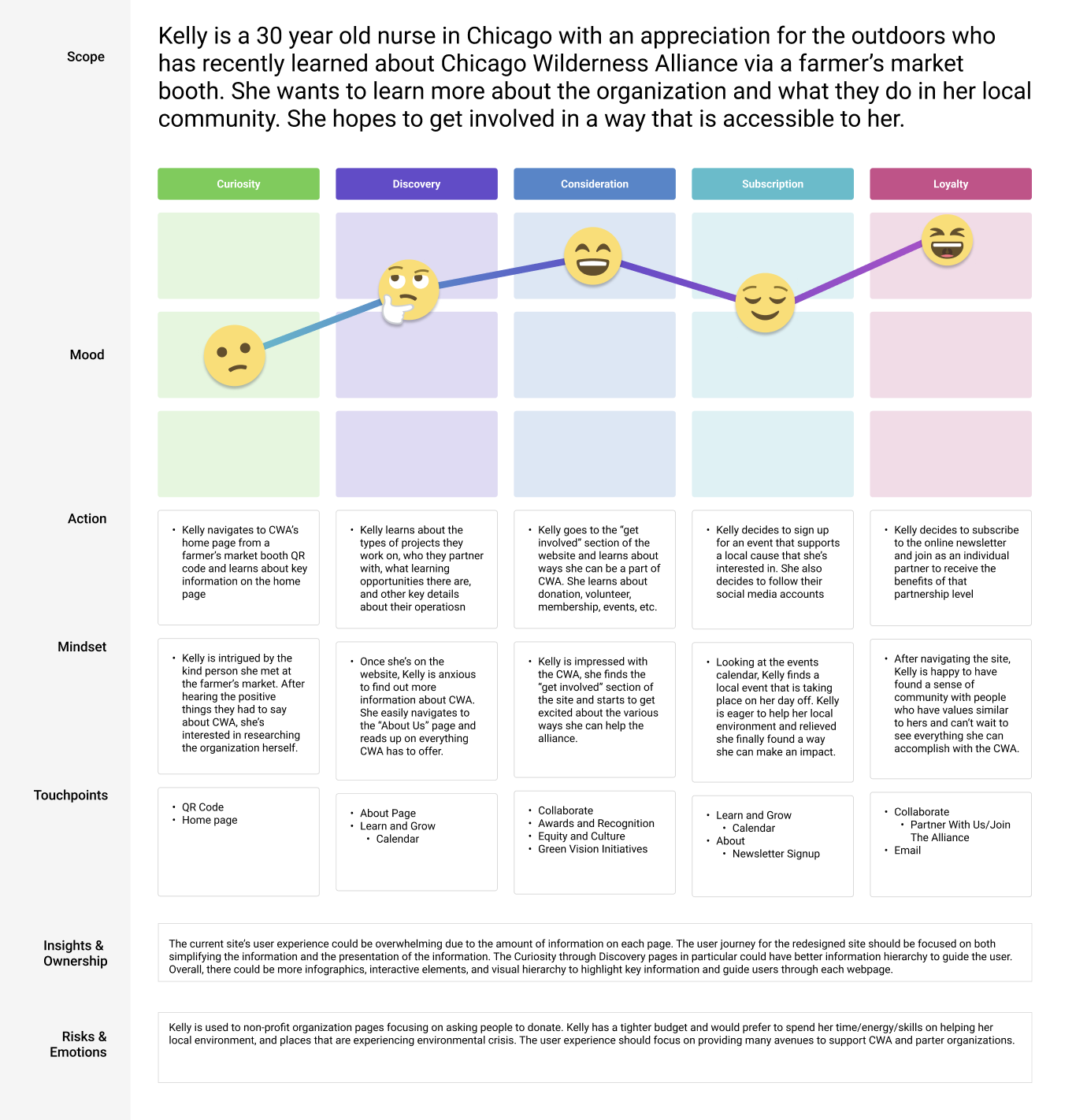
Building on our problem statement and insights from the user persona, we developed a user journey map to connect Kelly to the organization’s newsletter.
The user journey begins with Kelly navigating to the Chicago Wilderness Alliance (CWA) homepage, where she gains a clear understanding of the nonprofit’s mission. From there, she navigates to the "Get Involved" section and decides to sign up for the monthly newsletter.
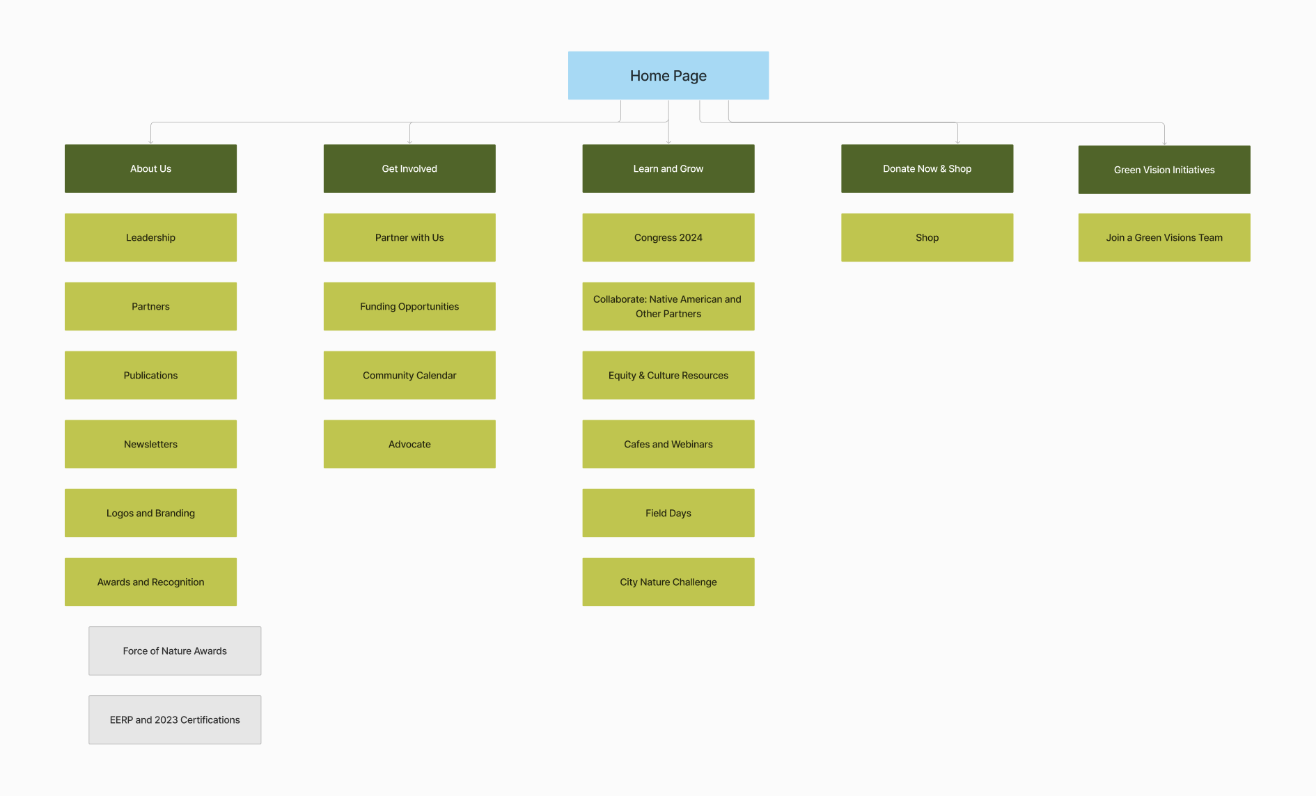
With the user flow in place, we restructured the website’s information architecture to create a more intuitive experience. The end result cuts down eight menu items to five, and organizing the webpage by overarching topic.
Lastly, we completed a "Diverge/Converge" exercise to help prioritize the UI aspects of the site. Our diverge exercise included summarizing the top priority fixes from the content audit. We then "converged" these issues into four key themes:Login/Sign-up process
Reorganization of the homepage content
Simplified menu layout
Clearer overall structure and content comprehension
Improved design system
Our team determined that maintaining visual interest and presenting digestible information would guide Kelly through the discovery phase.
We began by reviewing the site’s content hierarchy (top) and grouped similar content together under one topic. We then formed a diagram (bottom).
The prioritization matrix focused on features for families, excluding those aimed at supporting zoos, such as tiered memberships or donation options.
Prototyping
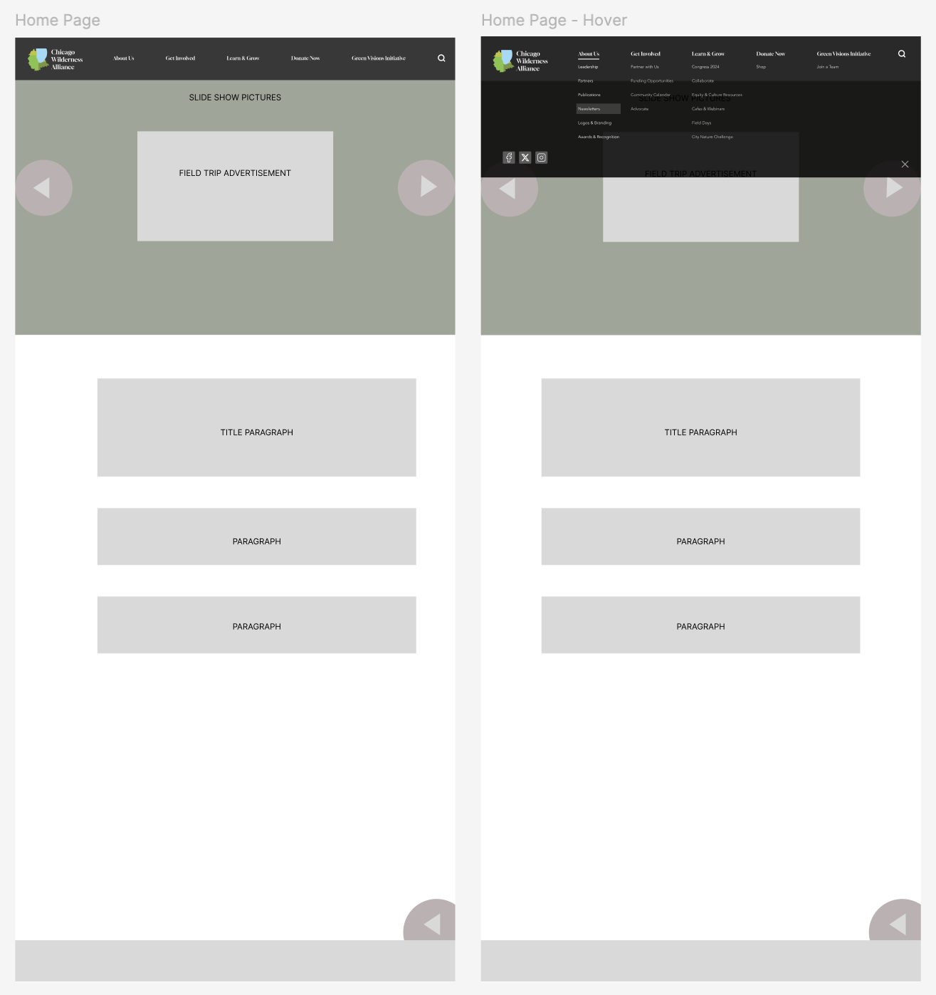
We began by iterating the desktop homepage to directly compare CWA's current site with our proposed design.
From there, we designed mobile low-to-mid-fidelity wireframes that guided users through the user journey of of signing up for the monthly newsletter. We kept the hero image carousel and navigation bar UI from the desktop iteration.
We first created a navigation bar which included the five menu items, a search function, CWA logo, and social links.
We brought the pop up form to the top of the newsletter page, and used a calendar to organize newsletters by year/month, shortening the webpage.
A/B Testing
To determine the most effective way to encourage newsletter sign-ups, we conducted an A/B test to assess user engagement with a pop-up call to action.
For our control group, the homepage had no pop-up, while the variation featured the pop-up CTA. We hypothesized that If we implement a Call to Action pop-up on the home page, then new users will be more likely to engage with the Chicago Wilderness Alliance site.
We used Google Surveys to conduct the test, targeting the same demographic as our initial survey. In the survey users were shown a video walkthrough of both the control and variation prototypes and answered questions.
The results revealed that while both variations were similar in terms of navigation ease, Variation B (with the pop-up) was preferred by a narrow majority (53.8%). Additionally, 70% of users interacted more with the pop-up options, confirming that the pop-up was an effective tool for increasing user engagement.
Our hypothesis: If we implement a Call to Action pop-up on the home page, then new users will be more likely to engage with the CWA site by contacting the organization, donating, or signing up for the monthly newsletter.
Final prototype and updated branding
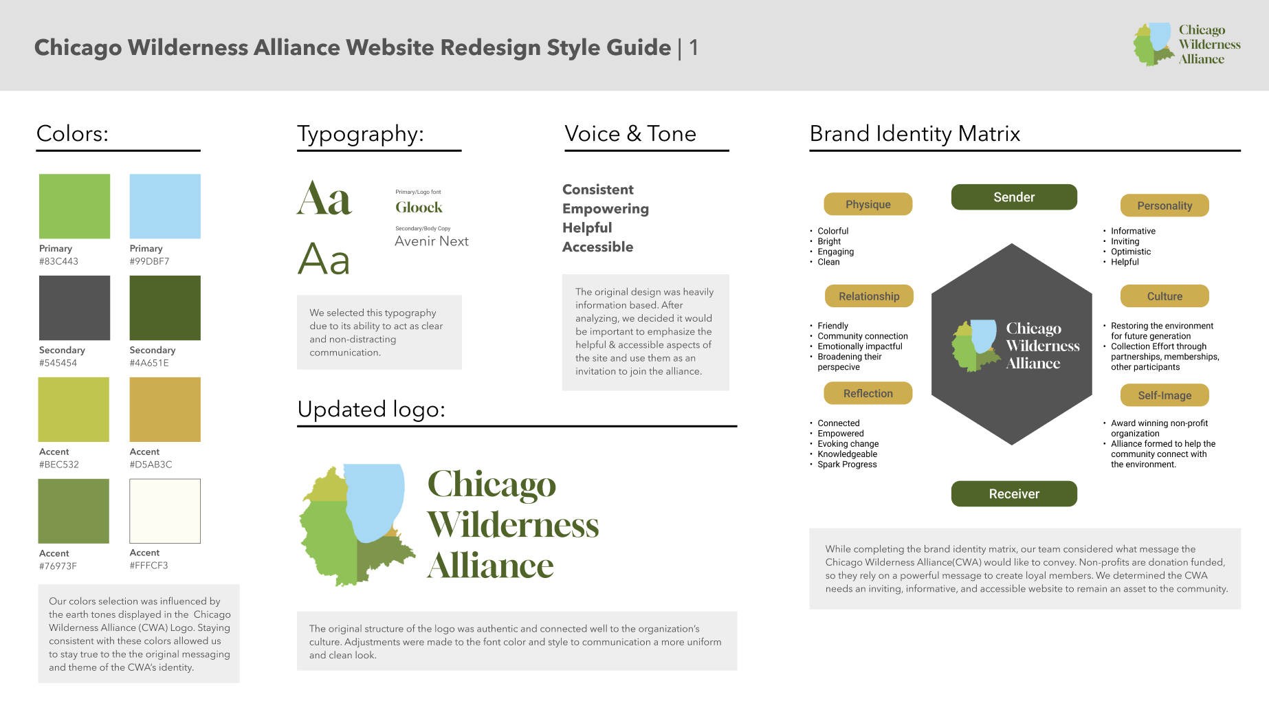
We iterated on variation B to build the final prototype. The process included a brand voice analysis of CWA and updating the brand and UI to captivate more visual interest for users.
We determinded the site needs to be engaging and informative in an educational way. I co-led the creation of the style guide, which involved updating fonts, colors, image treatments, and UI elements to ensure consistency and visual appeal across the prototype.
The final prototype incorporated the new style guide and allowed users to interact with key features like the search function and the menu, making it easy to navigate to the newsletter. We also simplified the footer and implemented a sticky header, improving navigation across the site.
The current colors used on the site supported CWA’s brand as they are bright and engaging. However, the use of brand colors throughout the site was limited.
The color pallete was extended to include a neutral tan color used in the newsletter pop-up and newsletter subscription confirmation page.
Takeaways
This project was a fulfilling challenge in applying the user experience process to a technology I am less familiar with. Our team was able to develop a foundational AR concept tailored to a family-friendly learning exploration. We focused on user-centric design informed by prelimiinary research and user feedback for an intuitive and entertaining experience.
Based on user feedback, the next steps of this project would include expanding the AR feature, broadening user testing to include feedback from children, and collaborating with zoos to ensure the features integrate with their operational goals.
